Readers’ Ink Case Study
The Product:
Sometimes reading can be lonely and it is difficult to meet up with other book lovers in person—or even to find them at all! How might we create a community that can connect via books?
Project Duration:
July 2022 to August 2022.
The Problem:
It can be difficult to participate in a routine book club when life is so hectic. Sometimes the books chosen aren’t even interesting.
The Goal:
Design an app for book lover’s that allows the user to choose their own reads while still participating in discussions, offering recommendations, and keeping track of their favorites.
My Role:
UX designer designing an app for book lover’s from conception to delivery.
Responsibilities:
Conducting interviews, paper and digital wireframing, low and high-fidelity prototyping, conducting usability studies, accounting for accessibility, and iterating on designs.
User Research: Summary
I conducted interviews and created empathy maps to understand the users I’m designing for and their needs.
A primary user group identified through research was working adults who don’t feel like they have time
dedicate to reading.
This user group confirmed initial assumptions about U.S. readers, but research also revealed that people age 15 - 44 spend less than 10 minutes a day reading and up to 43 million U.S. adults have low literacy skills. Furthermore, reading can help reduce mental decline by up to 32% and reading fiction can make you a better decision maker, as well as increase emotional intelligence. Other user problems included obligations, interests, or challenges that make it difficult to find time to read.
User Research: Pain Points
Persona: Anita
Problem statement:
Anita is a busy accountant and also mother of three who needs a way to fit in her favorite hobby, as well as socializing with others who share her interests because she rarely has time for herself and can never make it to conventional book clubs.
User Journey Map
Mapping Anita’s user journey revealed how helpful it would be for users to be able to interact with other users who love reading books.
Paper Wireframes
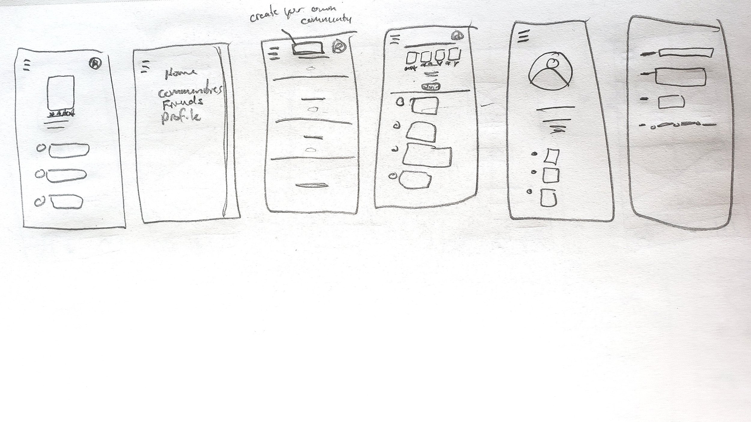
Paper wireframes allowed for easy and quick iterations to make decisions on what to prioritize before moving to digital. For the home screen,
I initially decided to open on the current book trending within the app.
Digital Wireframes
As the initial design phase continued, I made sure to base screen designs on feedback and findings from the user research.
Digital Wireframes
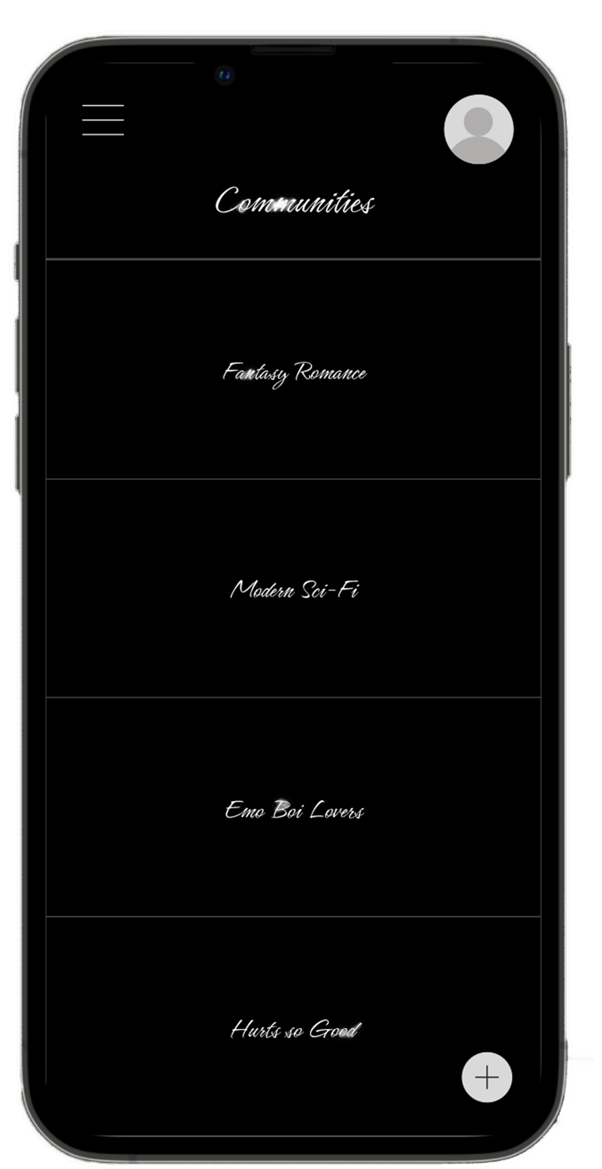
Creating communities was a distinctive part of the app that would solve one of the major problems of users’— a lonely experience,
Low-Fidelity Prototype
Using the completed set of digital wireframes, I created a low-fidelity prototype. The primary user flow I connected was joining and creating communities so the user flow reflects this.
View the Book Lover’s App:
Usability Study: Findings
-
Create
Users want to see the create tab more prominently
-
Community
Users want communities options
-
Expansion
Users want more than just communities
Mockups
In the beginning I thought to open on a book that would be trending, found that it could be confusing for the user, so I switched to a plethora of books recommended by other users as the main home page.
After Usability Study
Before Usability Study
Mockups
The usability study also revealed that having a more prominent way to create a new community was necessary, so a button was also added near the bottom.
Before Usability Study
After Usability Study


High-Fidelity Prototype
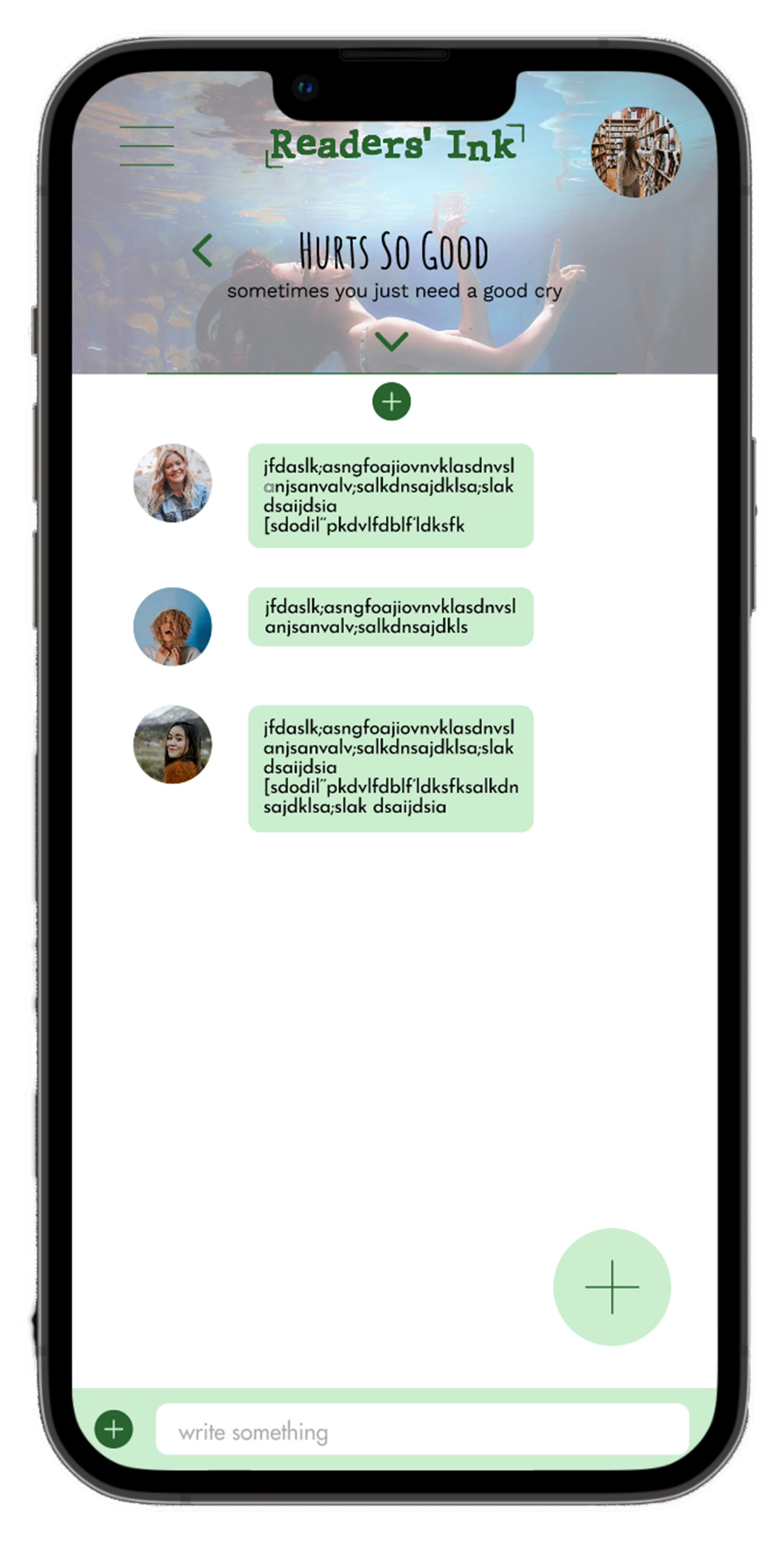
The final high-fidelity prototype presented cleaner user flows for joining and accessing communities, keeping track of books read, and finding new reads.
View the Readers’ Ink App:
Accessibility Considerations
-
There are alt text to images available for screen readers.
-
A main menu as well as icons to create a smoother navigation experience.
-
Colors are AA approved.
Takeaways
Impact:
The app makes users feel like Readers’ Ink reignites their desire to open a good book.
One quote from peer feedback:
“Oh, wait, are all of those recommendations? Cool!”
What I learned:
While designing the Readers’ Ink app, I learned that as more feedback comes in, the greater the impact on the overall design.
Next Steps
1.
Another round of usability studies to determine if the pain points have been concluded.
2.
Continue to conduct more user research and further refine designs.


