Sempre Tempo Case Study
The Product:
We’re creating an app/responsive website that will allow users to order orchestra music
Project Duration:
April 2022 to July 2022.
The Problem:
Keeping up-to-date on new releases of albums can be difficult when life gets in the way.
The Goal:
Design an app for those who love symphony music that allows the user to be the first to order music and support their favorite orchestra.
My Role:
UX designer designing an app for orchestra listeners from conception to delivery.
Responsibilities:
Conducting interviews, paper and digital wireframing, low and high-fidelity prototyping, conducting usability studies, accounting for accessibility, and iterating on designs.
User Research: Summary
I conducted interviews and created empathy maps to understand the users I’m designing for and their needs.
A primary user group identified through research was adults ages 28 - 34, as well as 58 - 65.
Previous research has concluded that those who choose to pre-order usually do so for several reasons. 1: To support an artist that they like. 2: To be one of the first to listen to new music.
User Research: Pain Points
Persona: Sarah
Problem statement:
Sarah is a busy computer analyst who needs a way to enjoy her favorite music anywhere, and schedule it ahead of time because she needs a break and doesn’t have time to get it as soon as it becomes available.
User Journey Map
Mapping Sarah’s user journey revealed how helpful it would be for users to be able to shop for their favorite orchestra albums.
Paper Wireframes
Paper wireframes allowed for easy and quick iterations to make decisions on what to prioritize before moving to digital. For the home screen,
I experimented with different ways to display the albums, as well as how the user would interact with each page.
Digital Wireframes
As the initial design phase continued, I made sure to base screen designs on feedback and findings from the user research.
Digital Wireframes
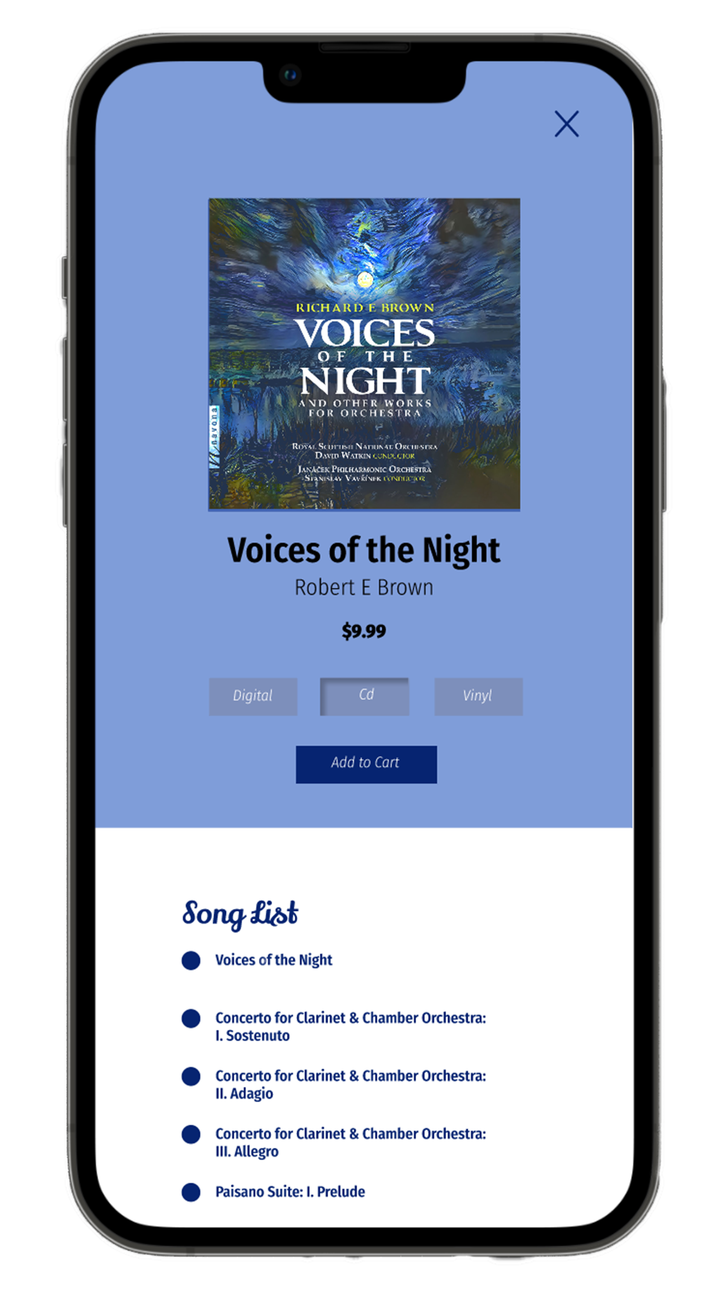
When opening a album, it was important to have options for different media experiences as was supported by the research. Along with the basic information on the album, there are also similar albums underneath to choose from.
Low-Fidelity Prototype
Using the completed set of digital wireframes, I created a low-fidelity prototype. The primary user flow I connected was finding the newest albums and placing an order, so the user flow reflects this.
View the Orchestra Album Pre-Order App:
Usability Study: Findings
-
Options Menu
Users need a way choose how they want their music before they add it to their cart.
-
Tracking Info
Users need to be able to quickly and more easily find tracking information on their shipments.
-
Newest Album
Users need to be able to differentiate the newest album at a glance, and/or sort it easily.
Mockups
Once the buttons were included, I further fleshed it out by adding typography, color, and hierarchy to make it distinctive and easy to interact with.
After Usability Study
Before Usability Study
Mockups
It was also revealed that users preferred having a place to organize their music, so the library added another category, ‘Playlists’.
Before Usability Study
After Usability Study


High-Fidelity Prototype
The final high-fidelity prototype presented cleaner user flows for sorting and looking up albums as well as completing the checking out process.
View the Sempre Tempo App:
Accessibility Considerations
-
There are alt text to images available for screen readers.
-
A main menu as well as icons to create a smoother navigation experience.
-
Colors are AA approved.
Sitemap
The main goal when creating the responsive site in addition to the app, was to make acquiring albums a simpler, more streamlined process. When conducting research it was found that some users would prefer not need to download an app first. An about page was also added, to give the user more information about who they’re purchasing from and why. A website would also allow a place for those who did want to download the app to have the perfect place to find it, so a link to the app is conveniently placed on the home page for easy access.
Responsive Design
The design of the website closely mirrors the design of the app, allowing the user to feel comfortable using both if need be.
High-Fidelity Prototype Web
The final high-fidelity prototype presented cleaner user flows for sorting and looking up albums as well as completing the checking out process.
View the Sempre Tempo Website:
Takeaways
Impact:
The app/site makes users feel like Sempre Tempo allows them to take a break.
One quote from peer feedback:
“Well, that was easy!”
What I learned:
While designing the Sempre Tempo, I learned that every piece is a small part of a much larger design. And if one part doesn’t fit, other things need to change in order to flow.
Next Steps
1.
Another round of usability studies to determine if the pain points have been concluded.
2.
Continue to conduct more user research and further refine designs.


